What Does “High-Converting” Actually Mean?
A high-converting website turns visitors into leads, inquiries, or customers at a measurably higher rate than average. The average website conversion rate across industries is between 2–5%. A well-optimized, strategically designed business website can achieve 8–15% or higher — meaning for every 100 visitors, 8 to 15 take a meaningful action like filling out your contact form or booking a consultation.
The difference isn’t magic. It comes down to a combination of clear messaging, smart structure, trust-building elements, and technical performance — all of which can be systematically built and measured.
🎯 The Core Principle of Conversion Design
Every decision on your website should serve one purpose: reducing the friction between a visitor arriving and them taking the action you want. Every element that doesn’t serve that purpose is a distraction that reduces your conversion rate.
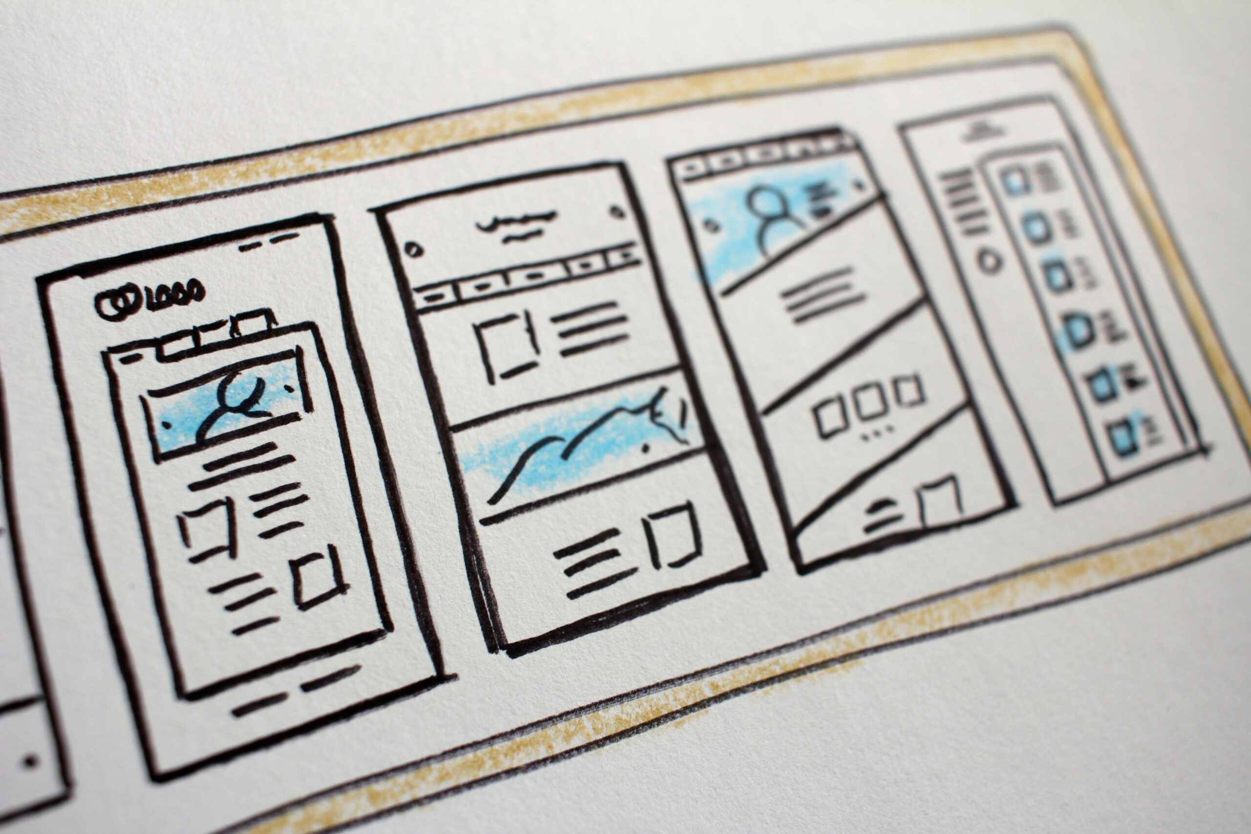
Part 1: Structure — The Blueprint Before the Design
Before colors, fonts, or images, your website needs a clear structural strategy. The most effective business websites follow a proven information architecture that guides visitors through a logical journey from awareness to action.
The Pages Every Business Website Must Have
🏠 Homepage
The strategic overview of your business. Immediately communicates who you are, who you serve, and what makes you different. Contains navigation to all key sections.
⚙️ Individual Service Pages
One dedicated page per service. Each page targets a specific keyword, speaks to a specific need, and has its own CTA. Never combine multiple services on one page.
👥 About Page
Builds personal trust. Includes your story, team photos, values, and specific credentials. People hire people — humanize your brand here.
📞 Contact Page
Frictionless conversion point. Keep the form short (name, email, message), include your phone number prominently, and add a Google Map if you serve locally.
Part 2: The Hero Section — Your 5-Second Test
Research shows that visitors form an opinion about your website in as little as 50 milliseconds. Your hero section — the first screen visible without scrolling — must pass the 5-second test: within 5 seconds, a complete stranger should know exactly what you do, who you help, and what to do next.
1. Headline (H1) — Your clearest, most benefit-focused statement. Include your primary keyword. Keep it under 10 words. Example: “Professional Web Design That Converts Visitors Into Clients.”
2. Subheadline — One sentence that expands on the headline and qualifies your audience. Example: “We build fast, SEO-optimised websites for startups and small businesses across Pakistan.”
3. Primary CTA Button — Action-oriented, high-contrast, impossible to miss. “Get a Free Quote” or “Book a Free Consultation” outperform generic “Learn More” buttons significantly.
4. Supporting Visual — A professional photo of your work, your team, or a relevant, high-quality stock image. Avoid generic stock photos of people shaking hands — they reduce trust rather than build it.
5. Social Proof Hook — One line of credibility directly in the hero: “Trusted by 50+ businesses across Lahore” or “⭐⭐⭐⭐⭐ Rated 5 stars by 30+ clients.”
Part 3: Trust Signals — The Conversion Multiplier
Trust is the single biggest barrier between a visitor and a conversion. For service businesses especially, a potential client is considering handing you their money and their business reputation. They need to be convinced you’re legitimate, experienced, and capable before they reach out.
The 6 Trust Signals That Move the Needle Most
- Specific client testimonials with real results. “Peak Edge Digital increased our website traffic by 200% in 4 months” with a name, photo, and company is exponentially more convincing than “Great service, highly recommend.”
- Client logos. A row of recognizable logos — even local businesses — signals that real organizations have trusted you with real work.
- Case studies or portfolio pieces. Show before/after results for past clients. Numbers, screenshots, and specific outcomes build enormous credibility.
- Team photos with real names and roles. Faceless agencies lose to agencies that show their team. Humanize your business deliberately.
- Certifications and credentials. Google Partner status, relevant industry certifications, or notable media mentions — display these prominently.
- Response time promise. “We respond to all inquiries within 24 hours” reduces hesitation at the point of contact significantly.
💡 Placement Tip: Don’t save all your trust signals for the About page. Distribute them throughout the site — put testimonials near CTAs, put client logos on the homepage, and put specific results on service pages where the visitor is making their decision.
Part 4: Service Pages That Actually Sell
Your service pages are where purchasing decisions are made. Most business service pages are essentially brochures — they describe what the service is without persuading the visitor that they need it, that you’re the right provider, or that they should act now. A high-converting service page is structured differently.
Section 1 — The Problem. Open by articulating the pain point your service solves. When a visitor reads “Are you struggling to appear on Google despite having a great website?” they feel understood, and keep reading.
Section 2 — Your Solution. Describe your service clearly in terms of outcomes, not processes. Not “We conduct technical SEO audits” but “We identify and fix the exact issues preventing your website from ranking, so your ideal clients can find you.”
Section 3 — What’s Included. A clear, specific list of deliverables. Vagueness kills conversions. Tell them exactly what they get.
Section 4 — Why Choose Us. Your differentiators. What do you do that competitors don’t? This is where your unique process, experience, or approach goes.
Section 5 — Proof. A relevant testimonial or case study specific to this service. Social proof placed at the moment of decision is your most powerful conversion tool.
Section 6 — CTA. A clear, low-friction next step. “Get a Free Consultation” converts better than “Buy Now” for service businesses because it reduces perceived risk.
Part 5: Technical Performance — The Foundation Everything Else Sits On
A beautifully designed, strategically structured website still fails if it loads slowly, breaks on mobile, or makes visitors feel insecure. Technical performance directly affects both your search rankings and your conversion rate.
Technical Performance Checklist
Part 6: The Contact Page — Your Conversion Endpoint
Your contact page is the final step in the conversion journey — and it’s where most businesses lose leads they’ve already earned. The most common mistakes are forms that are too long, contact pages that are hard to find, and pages that give visitors no reason to trust that their inquiry will actually be answered.
Keep your contact form to 4–5 fields maximum: name, email, phone (optional), and message. Every additional field reduces completion rates. Add a clear expectation of response time (“We’ll get back to you within 24 hours”), and consider adding a short testimonial directly on the contact page to reinforce confidence at the final moment of hesitation.
Final Thoughts: Design for Your Visitor, Not Your Ego
The most common mistake in web design is building a website that impresses the business owner rather than serves the visitor. Every decision — the layout, the colors, the copy, the CTAs — should be made by asking one question: does this make it easier for my ideal client to understand what I offer and take action?
When you design with that discipline, conversion rates follow naturally. Start with structure and messaging, layer in trust signals and technical performance, and treat your website as a living asset that you test, measure, and improve over time.
Ready to Build a Website That Actually Converts?
Peak Edge Digital designs high-converting websites built for SEO, speed, and lead generation from day one. Let’s talk about your project.
Let’s Discuss Your Project
Need help growing your business online? Get in touch with Peak Edge Digital today.